
Kusumi - (adjective, sanskrit) Blossoming
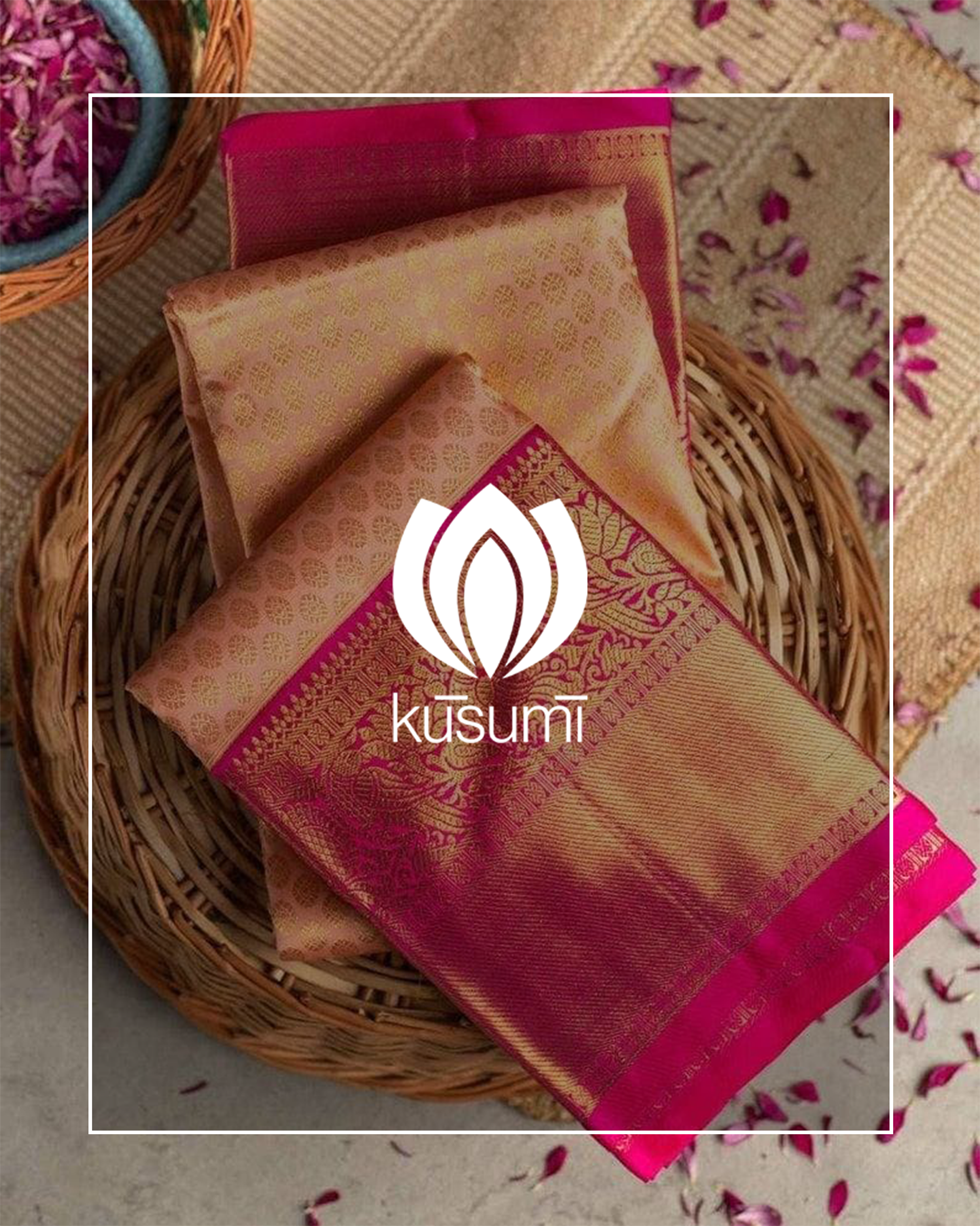
Kusumi is a local Kanjivaram sarees boutique. They are a bespoke brand, and believe in providing their customers with value and a personal touch.
An all-women owned business, they wanted their brand identity to reflect a fusion of traditional and modern, much like the Indian woman of today. Saree is the most quintessential clothing item found in any Indian woman's wardrobe and is a signifier of her cultural roots.
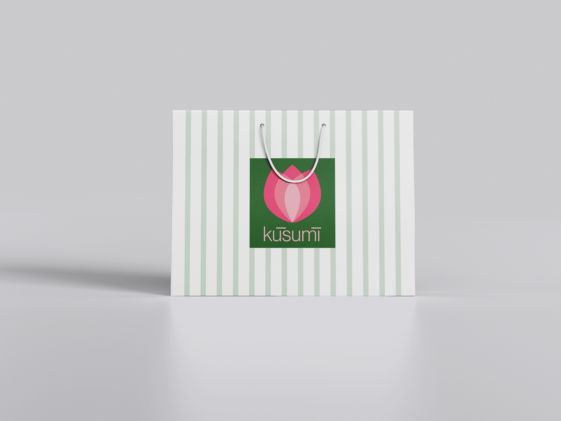
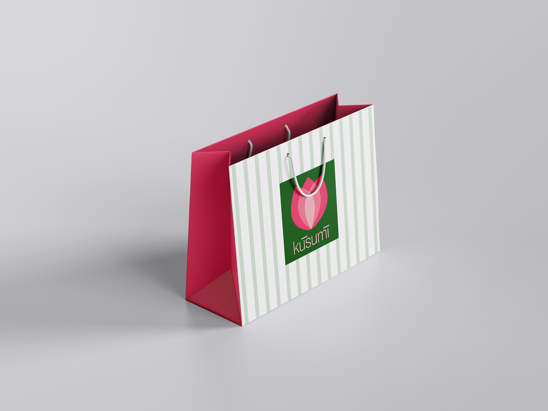
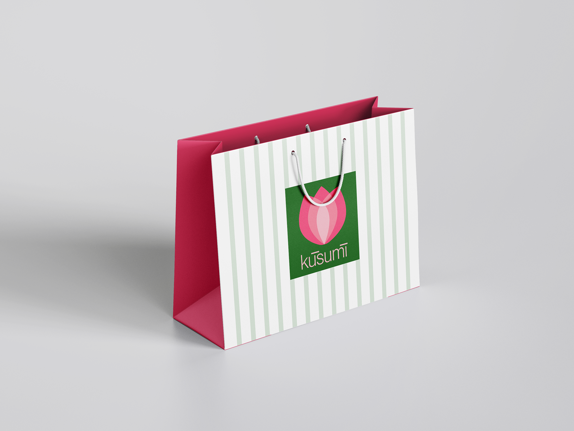
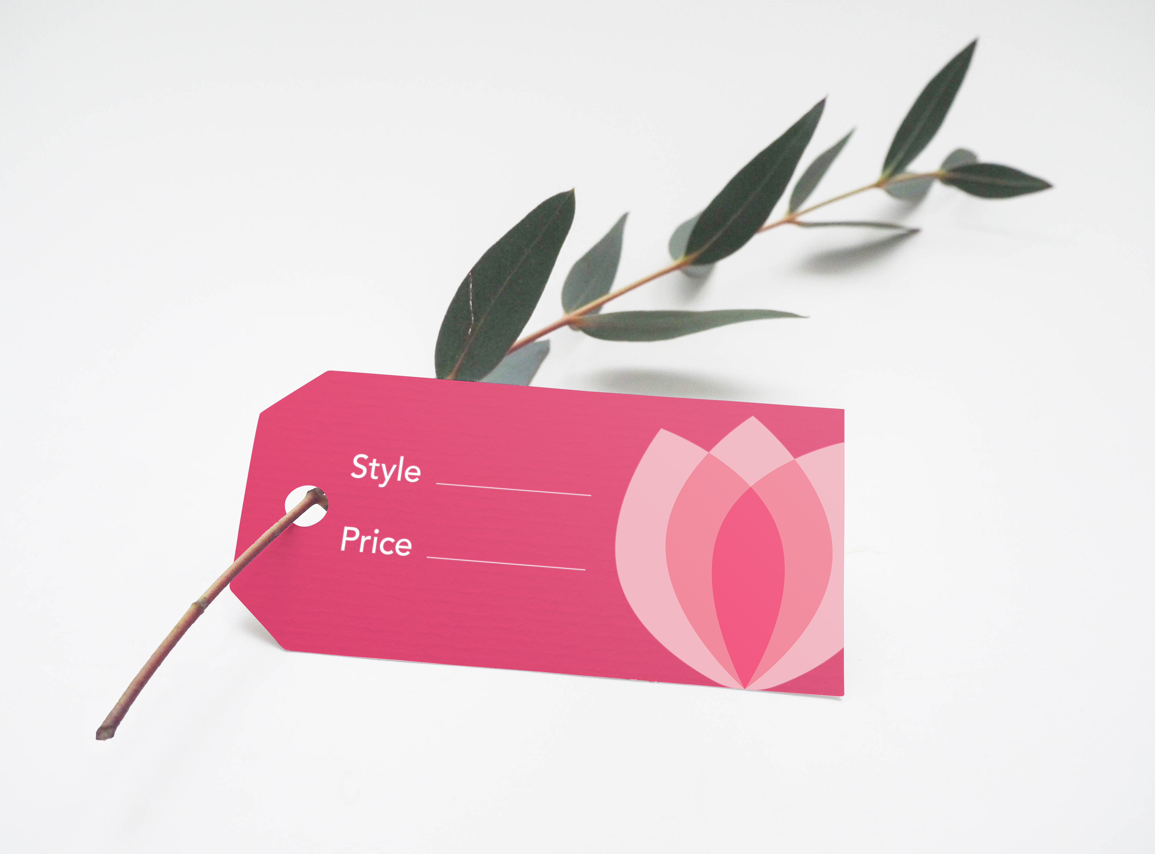
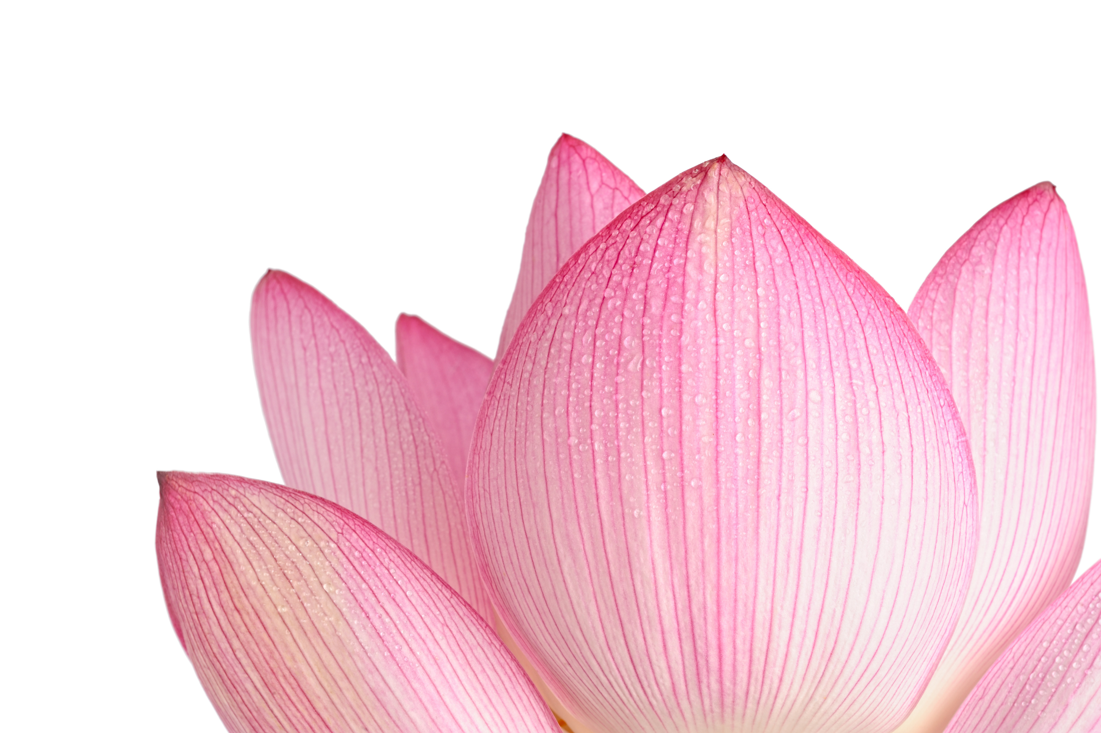
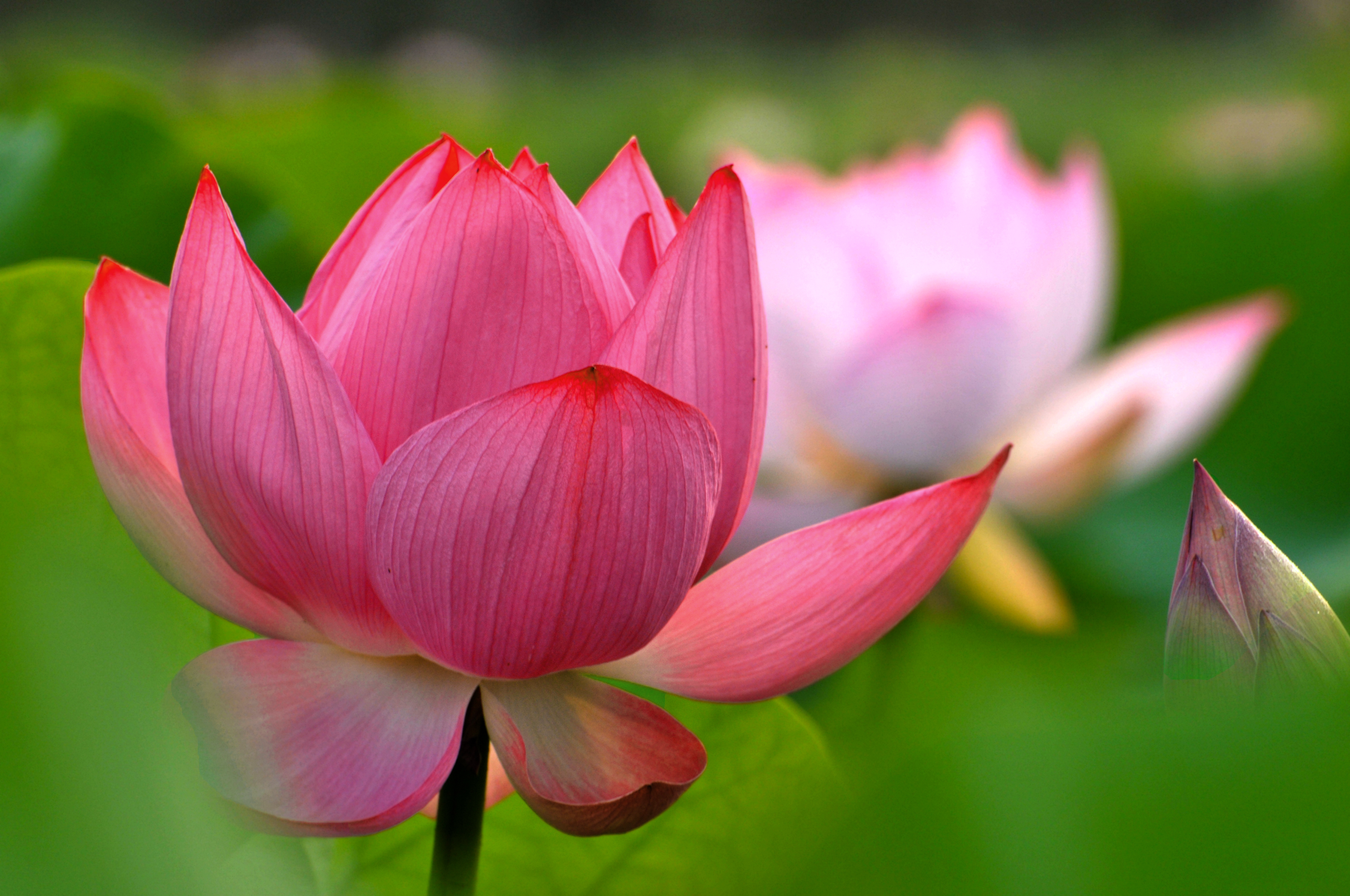
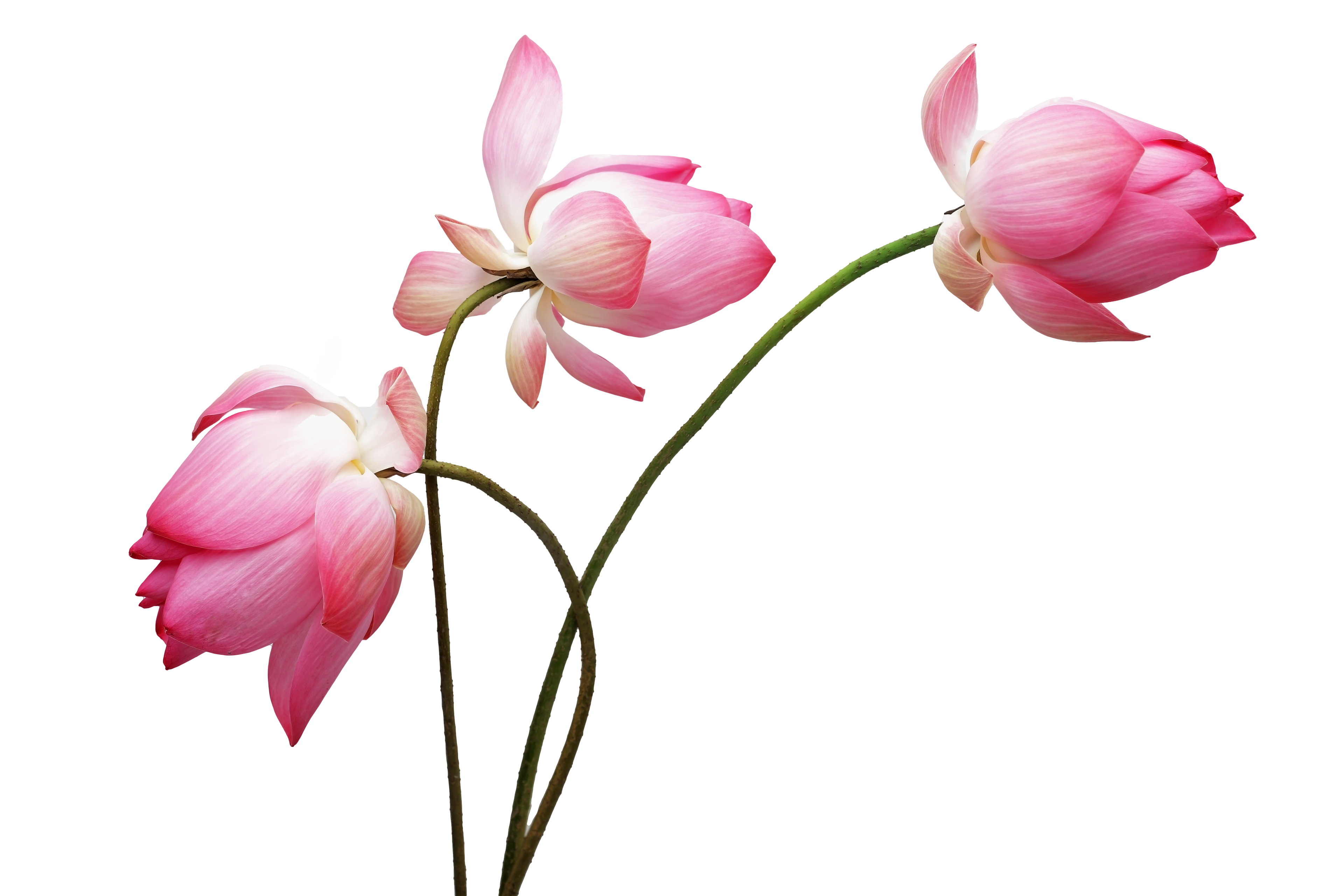
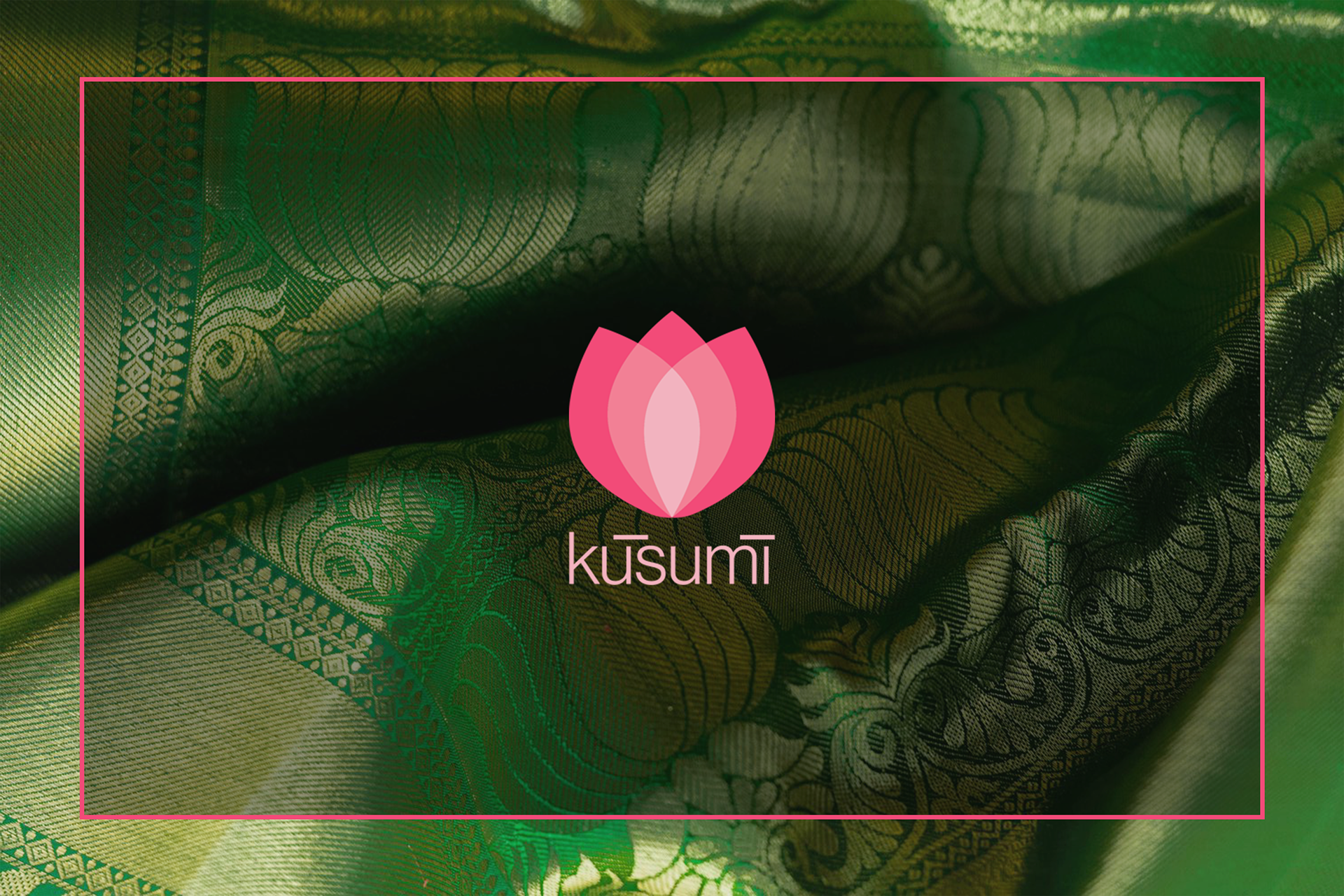
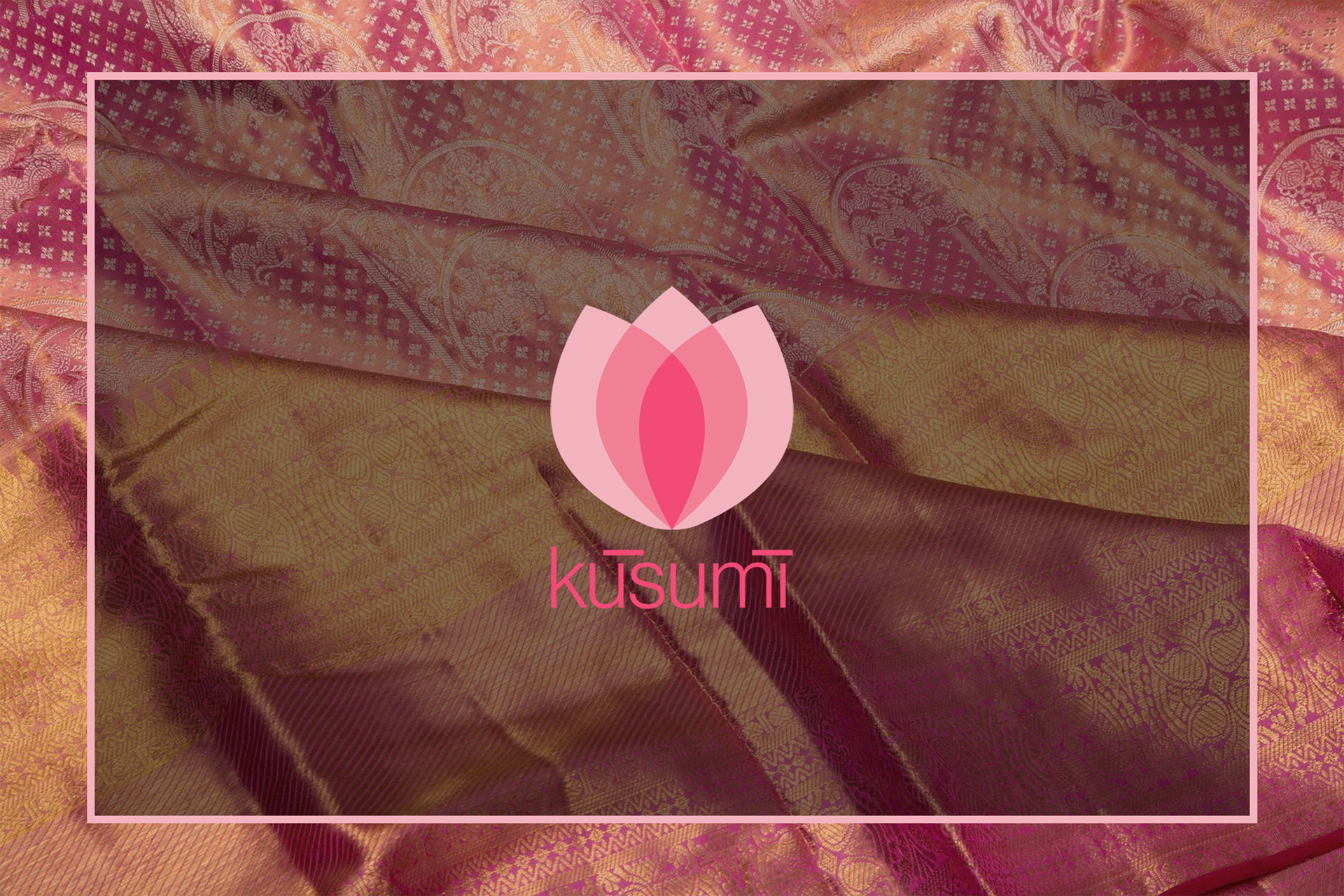
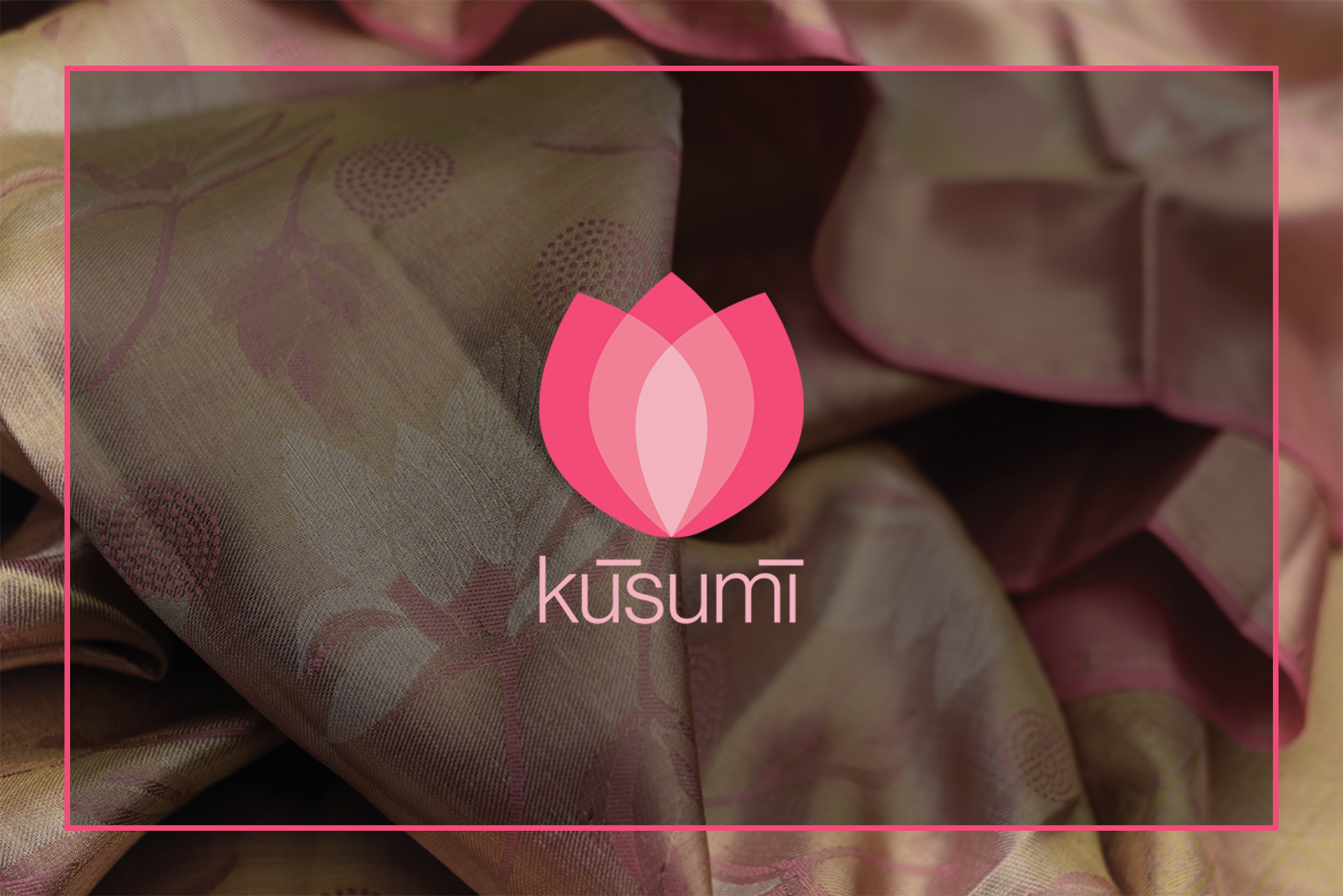
There is nothing more emblematic of an Indian woman than the Lotus flower. Elegant in its visage, resilient in its growth and graceful in its bloom, a Lotus brings out the feminine mystique beautifully. As such, I chose the Lotus flower as the primary motif for Kusumi.
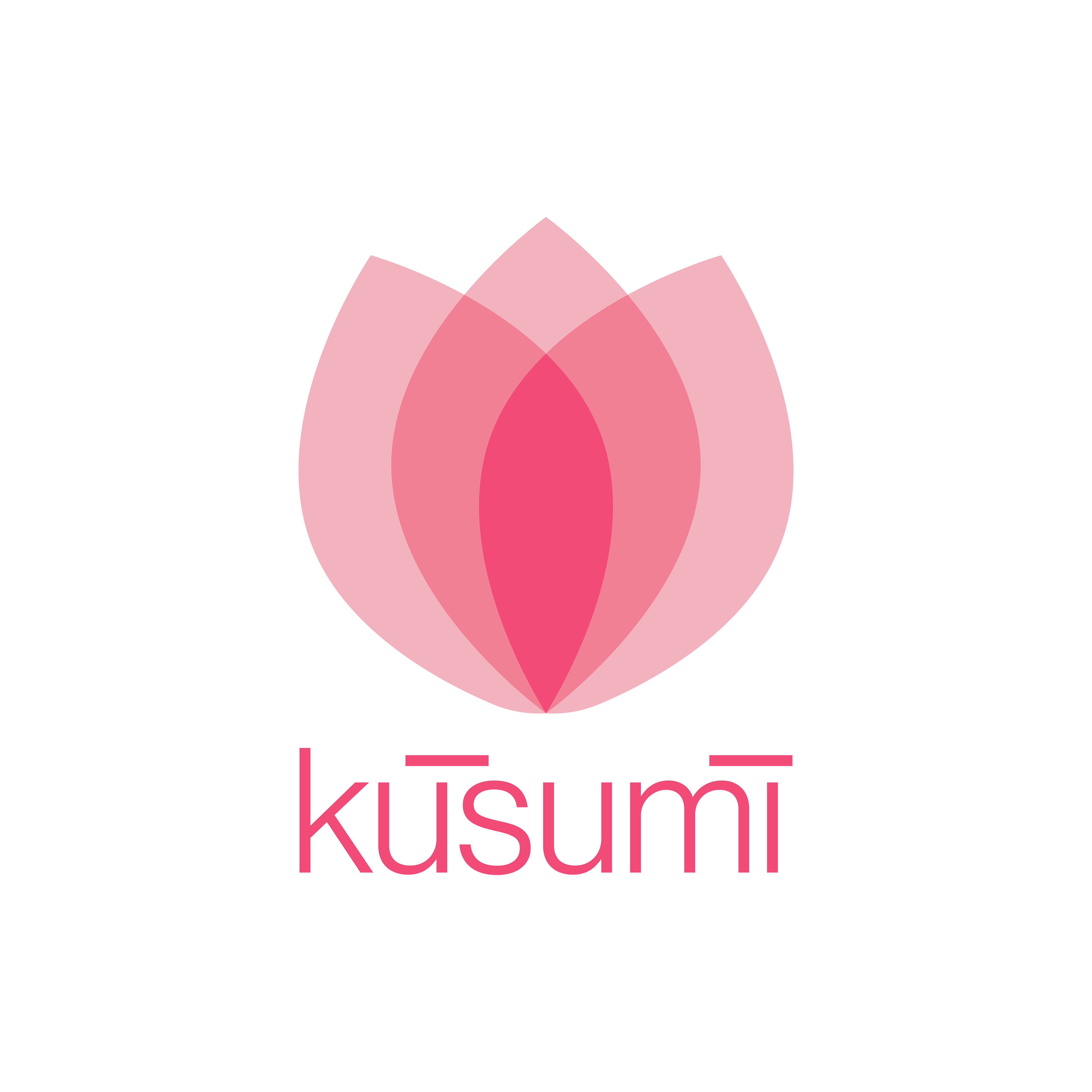
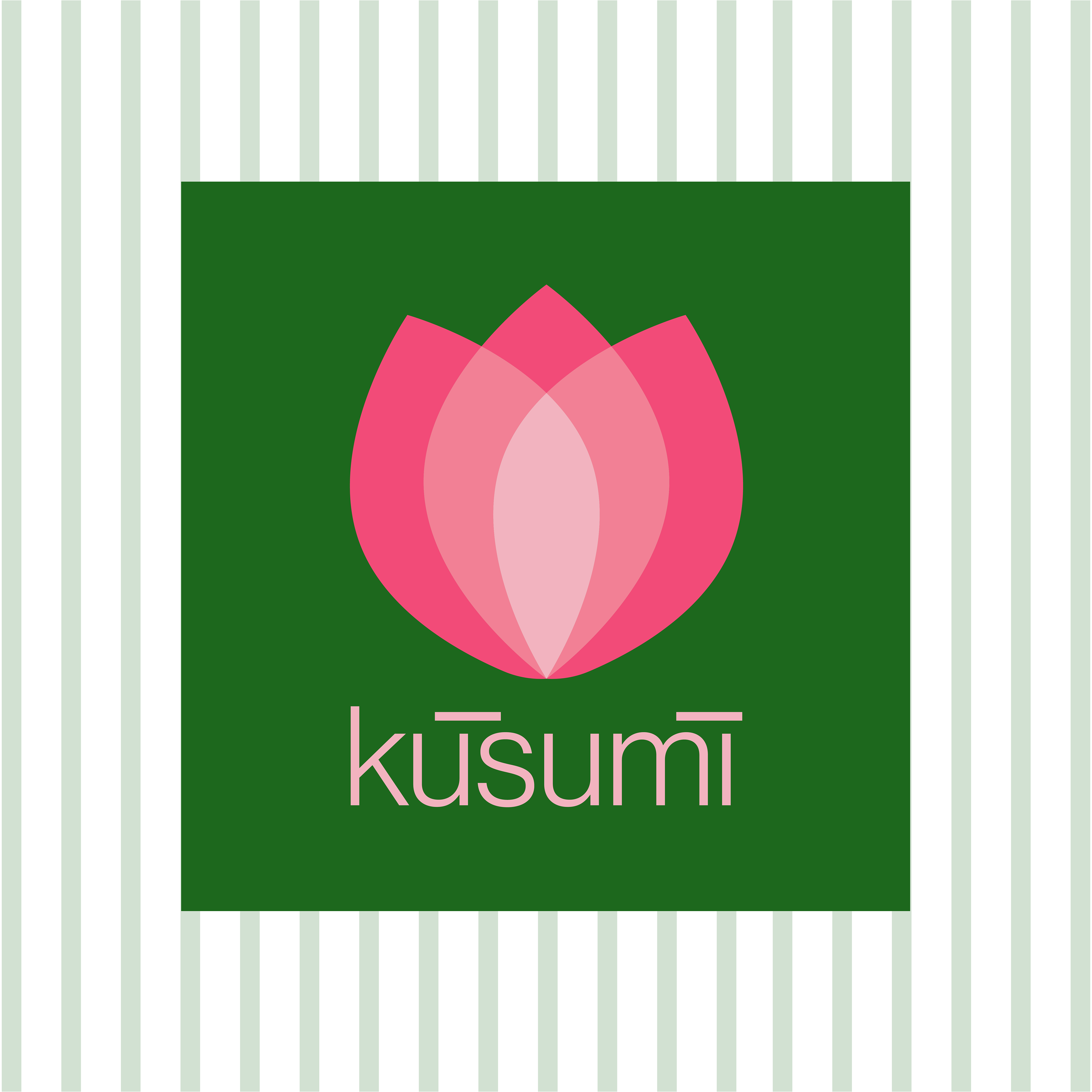
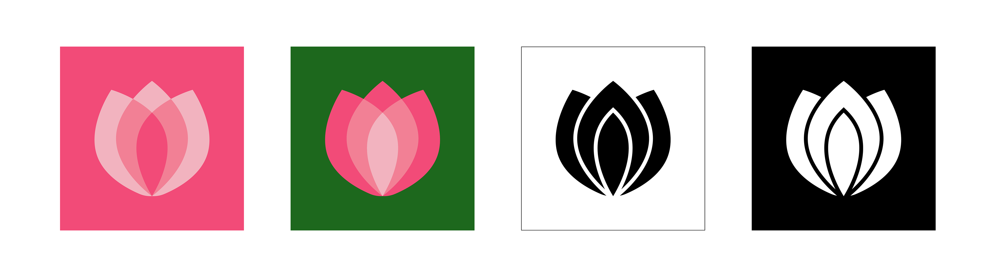
I wanted to emphasise the modernity through the form factor of the logo and traditionalism via the colours of the brand.
The clean, flat lines of the logo hint towards a sense of timelessness and chic, along with inner strength and grace. The Kanjivaram Saree is a rich, heavy silk that is, in itself, a woman's ornamentation. She chooses who she wants to be - a modern leader or a strong nurturer or an adventurous heroine. Or all of them.
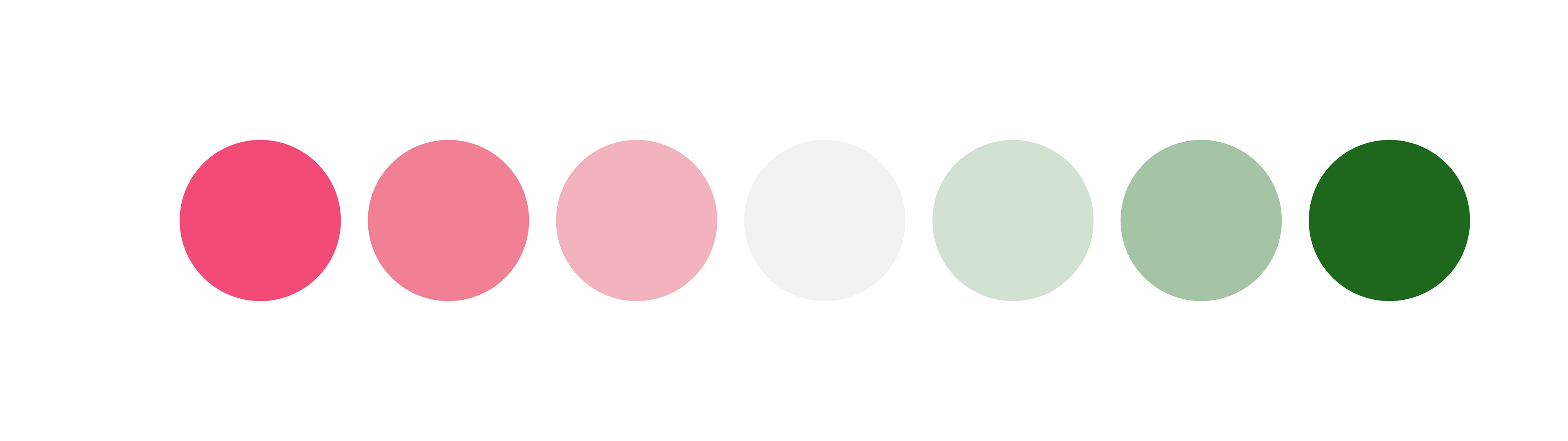
The pink indicates vibrancy & playfulness of a woman while the green alludes to the prosperous & bountiful land of South India, from where the Kanjivaram Saree hails.
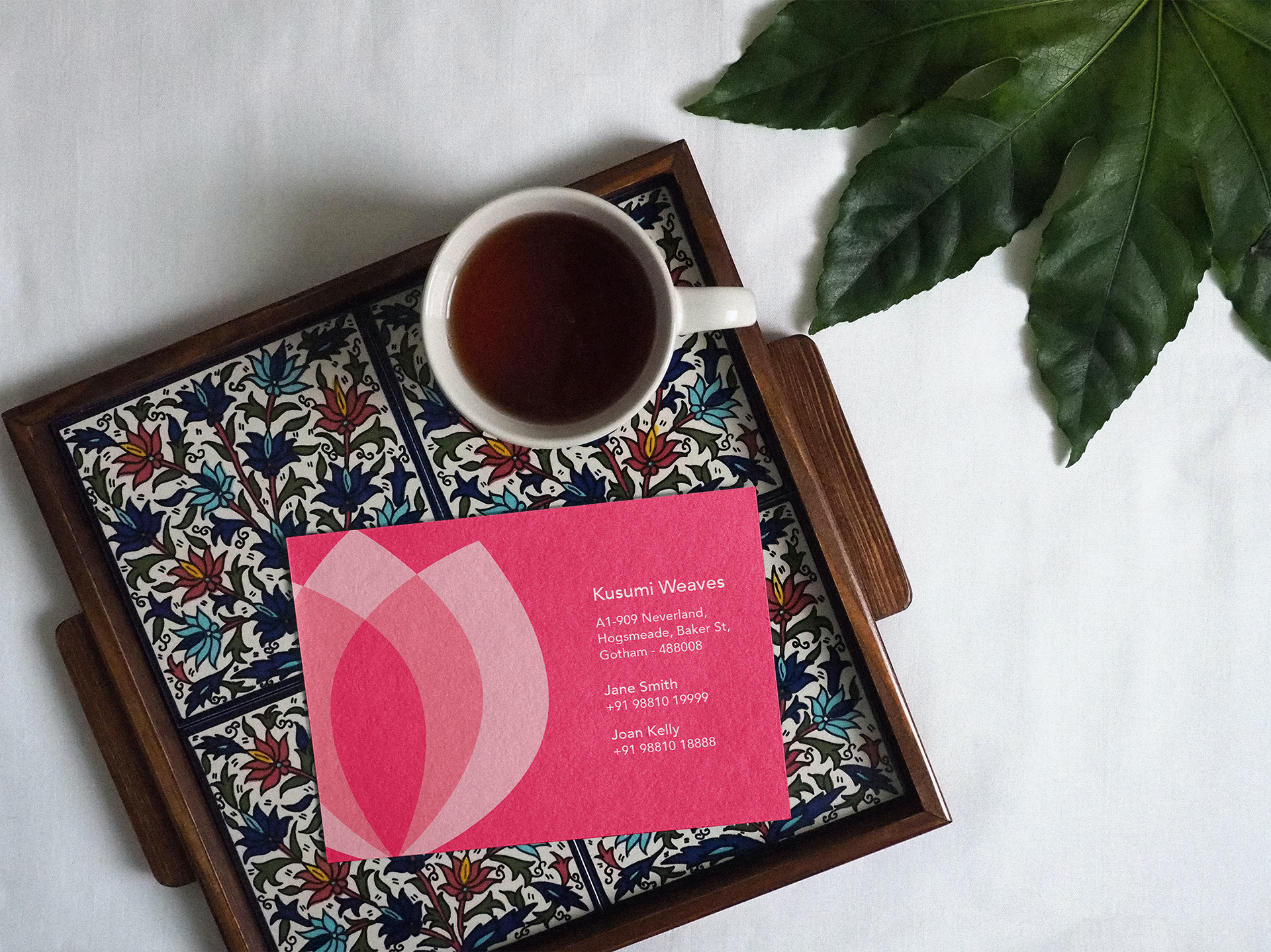
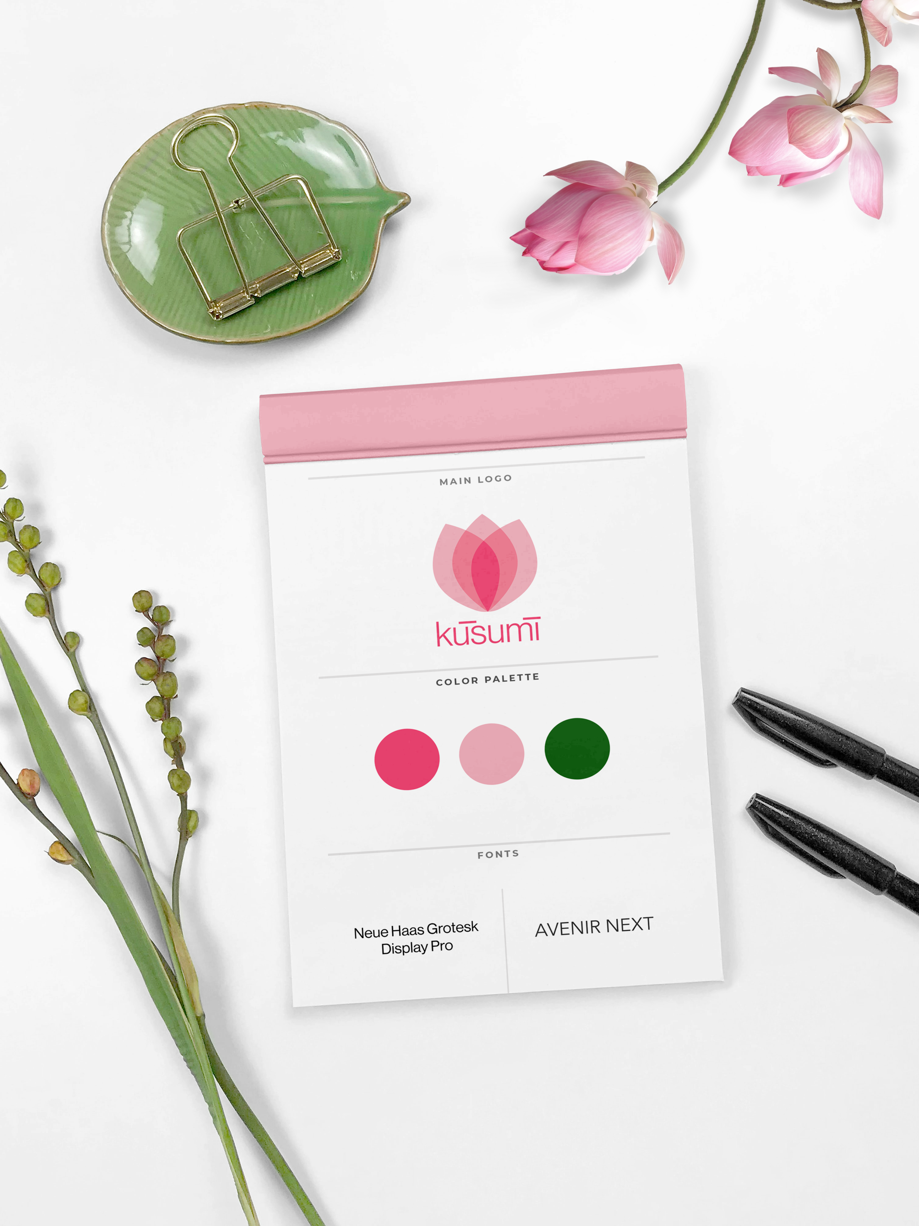
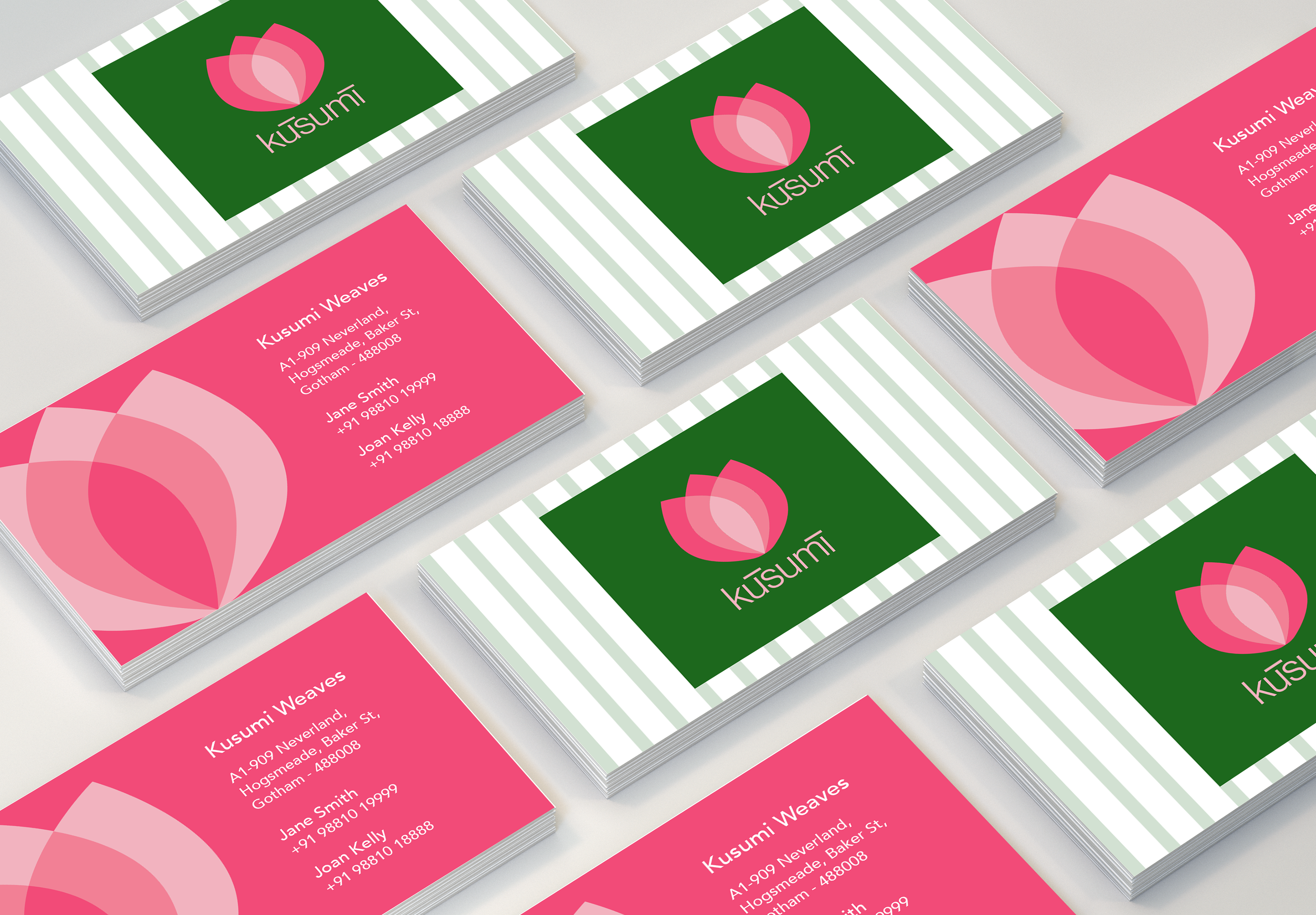
Along with the logo and imagery, I also designed some print collateral: the Kusumi business cards, shopping bag and saree price tag.